

A backsplash is a small surface with an oversized effect. It is usually less than 30 square feet, it costs a fraction of cabinets or countertops, and it is the thing people notice first when they walk into a kitchen. It is also the element homeowners most often regret, because it is easy to choose a tile you love in a showroom and then live with it under your own lighting for ten years.
So the kitchen backsplash ideas below are built around the order of decisions rather than a gallery of tiles. Get the order right and the tile choice becomes obvious.
Decide these three things before you look at tile
1. What your countertop is doing
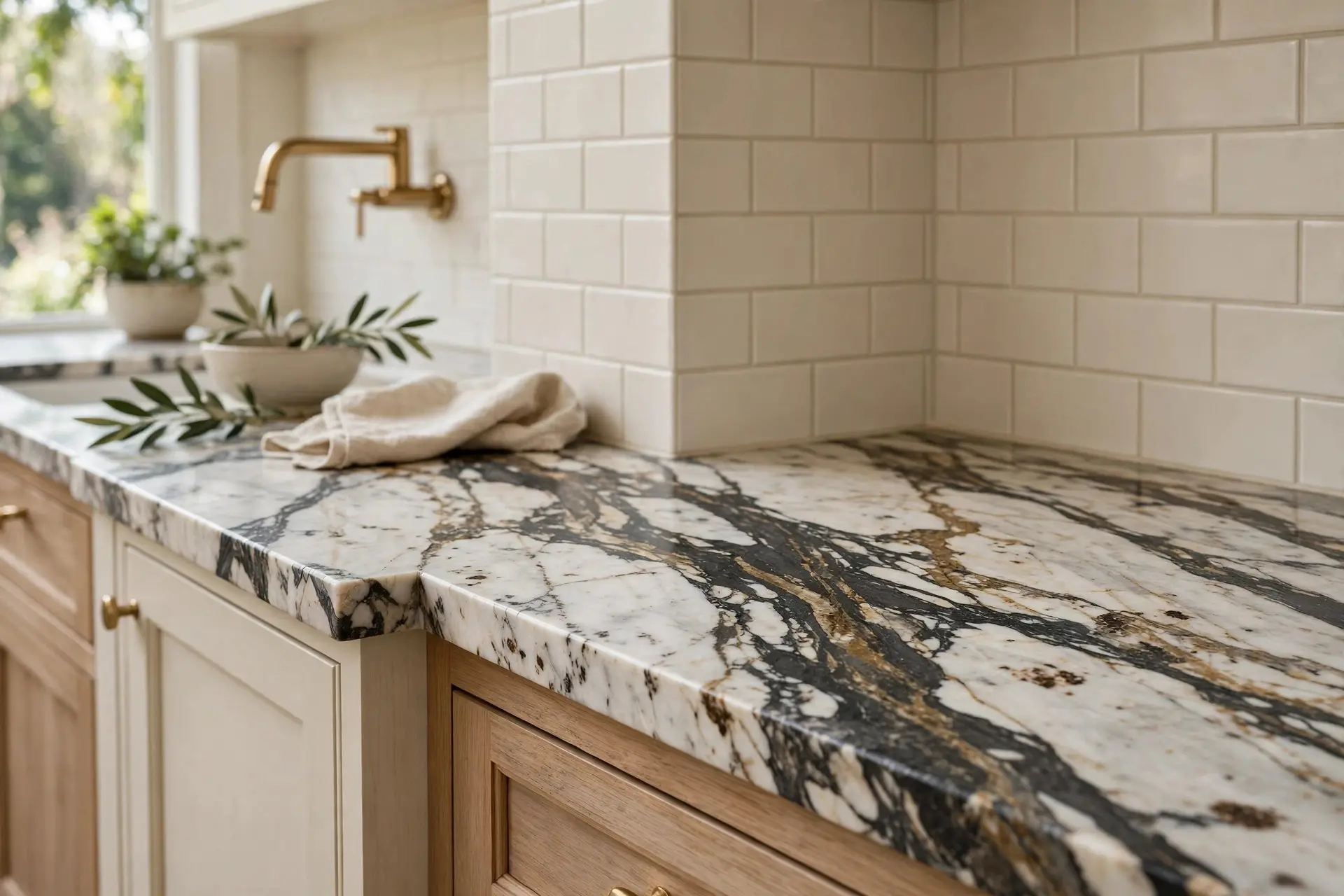
The backsplash and the countertop share a corner, and that corner is where most kitchens go wrong. The rule that works: one of them is the star, the other is the supporting cast.
If your countertop has dramatic veining, movement, or a strong colour, the backsplash should be quiet. A plain tile in a tone pulled from the stone will look expensive and calm. If your countertop is simple, solid, and unfussy, the backsplash is where you get to have fun.
Two busy surfaces meeting at a right angle is the most common and most expensive backsplash mistake. If you are still choosing stone, our kitchen countertop inspiration ideas guide is worth reading first, since the countertop decision should lead.
2. What your cabinets are
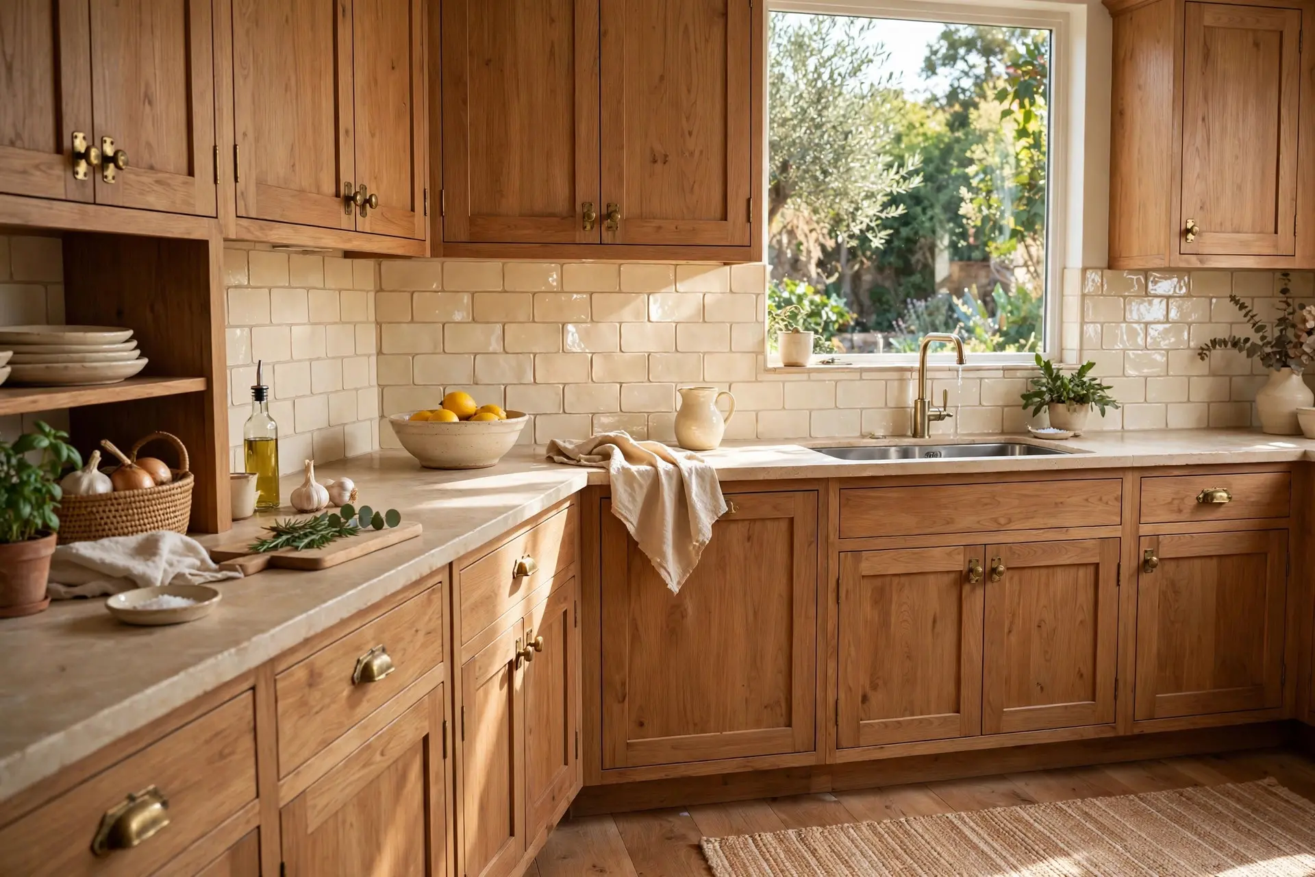
Backsplash tile sits directly against cabinet doors, so undertone matters more than colour name.
Warm wood, cream, and bone cabinets want warm tile. Cream, oat, clay, and soft taupe all sit comfortably against them. A cool white tile next to warm cabinets makes the cabinets look faintly yellow, which is a problem nobody notices until it is installed.
Dark cabinets are the easiest to work with, because almost anything reads well against them. If you are going that direction, our black kitchen cabinet ideas guide shows how backsplash choices shift when the cabinetry is the bold element.
3. How much you actually cook
This is the question nobody asks and everybody should.
If you cook properly most nights, with oil, sauces, and steam, then texture and grout lines behind the range are working against you. Handmade tile with deep, uneven grout lines is beautiful and it is genuinely more work to keep clean. That is not a reason to avoid it, but it is a reason to know it before you commit.
If you cook lightly, texture is nearly free. Choose the pretty thing.
The backsplash styles worth considering now
Slab backsplash
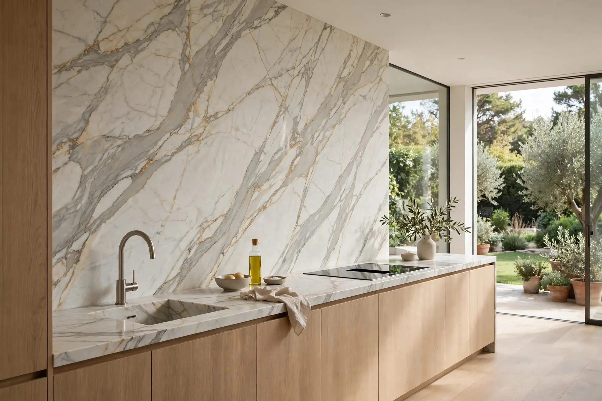
The same stone as your countertop, continued up the wall. No grout lines at all, nothing to scrub, and the veining runs continuously from the counter up, which looks quietly expensive.
It is the most low maintenance option in existence and also usually the priciest, since you are buying more of the same slab. A common middle path is to use slab only behind the range or the sink, and tile everywhere else.
Zellige and handmade ceramic
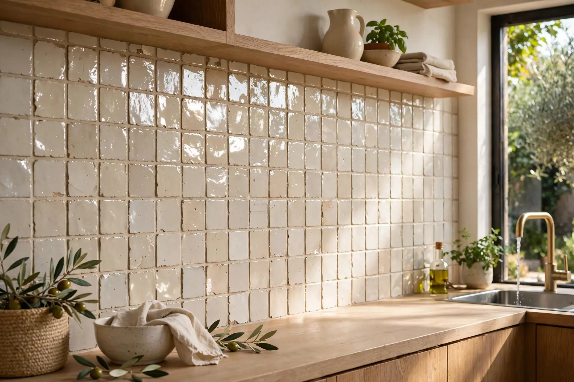
Hand glazed tile with uneven edges, small pits, and colour that shifts across the wall. It catches light in a way machine made tile simply cannot, and it is the reason so many recent kitchens look warm rather than clinical.
What to know: real zellige is irregular by nature, so batches vary, and you need extra for cuts and breakage. Porcelain versions imitate the look, install more predictably, and do not need sealing. Purists will tell the difference, most guests will not.
Subway tile, done properly
Subway tile is not dated, but one version of it is. White tile with dark contrasting grout in a running bond pattern has been done to death and now reads as 2016.
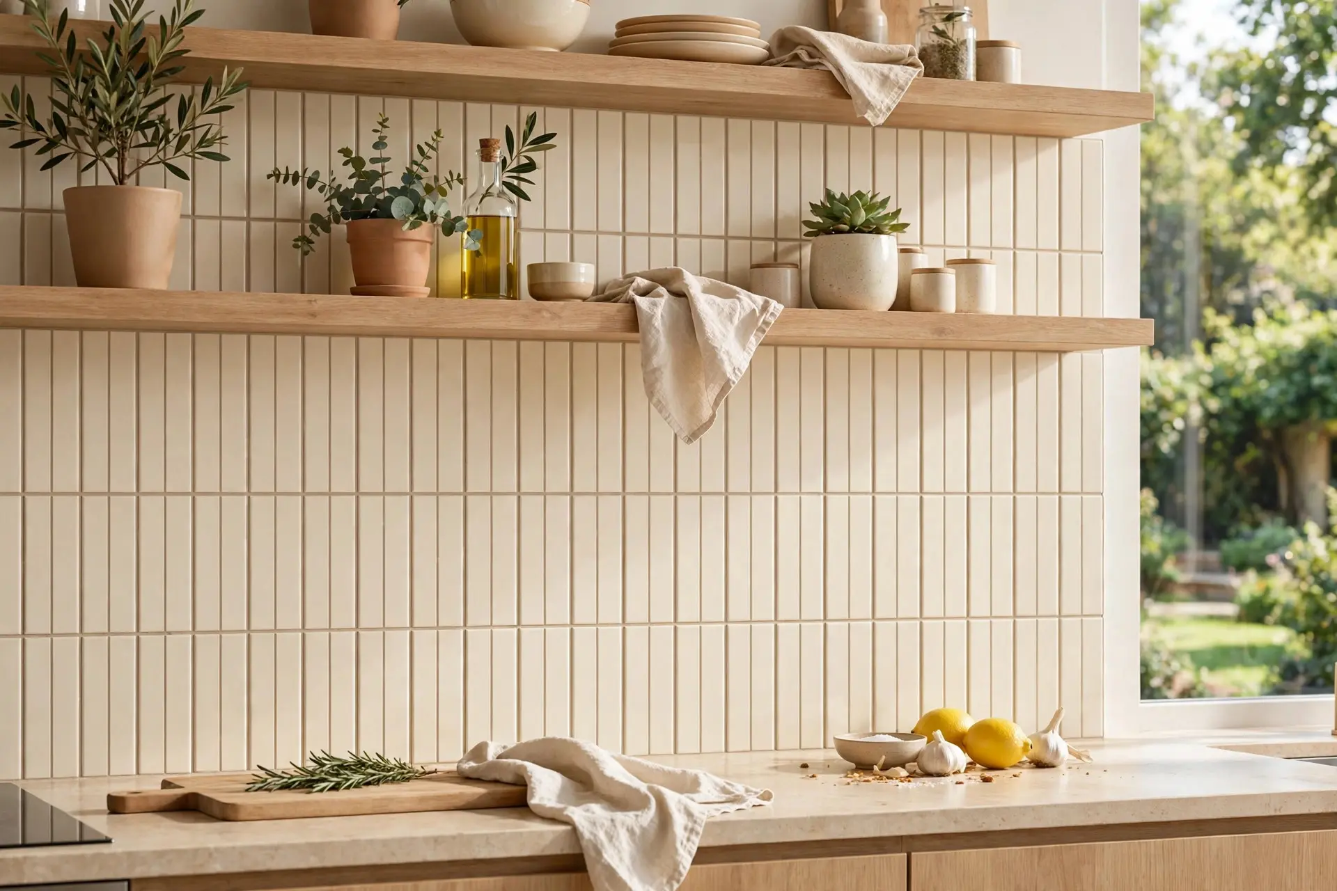
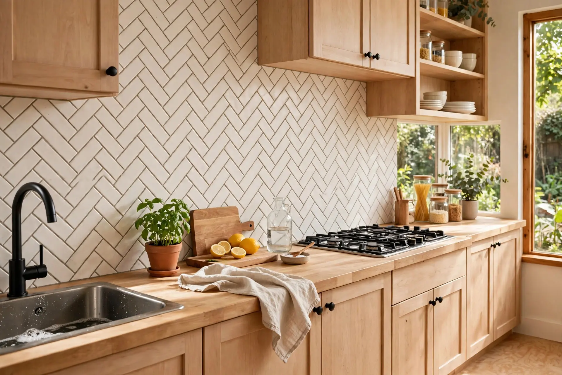
The current version keeps the format and changes three things: a warmer, creamier tile instead of stark white, grout matched close to the tile colour rather than contrasting, and a vertical stacked or herringbone layout instead of the standard offset. Same budget, completely different result.
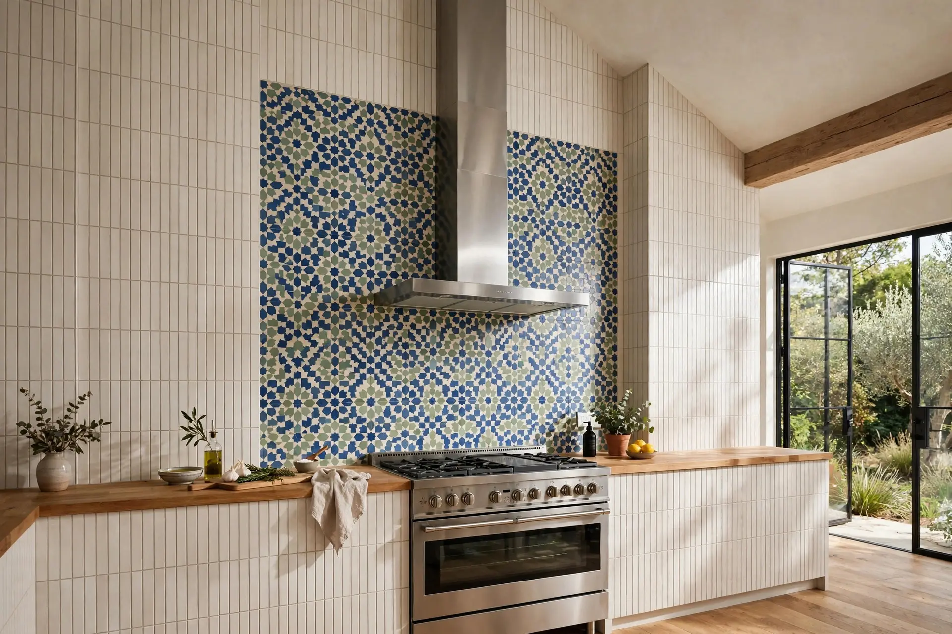
Full height behind the range
Running tile from countertop all the way to the underside of the upper cabinets, or to the ceiling where there are no uppers, has largely replaced the old four inch strip. It gives the eye a proper surface to land on and makes the kitchen feel taller.
Behind a range with no upper cabinets above it, taking the tile to the ceiling is almost always the right call. Stopping partway up leaves an awkward line that draws attention to itself.
A single colour moment
Sage, olive, muted blue, and clay are doing a lot of work in kitchens right now, and a coloured backsplash is the lowest risk way to use colour in a kitchen. Tile is far cheaper to change than cabinets, so if you want colour but do not want to commit, put it here.
Keep the rest of the palette calm and let the backsplash carry it.
Mixed materials
One statement material behind the range, something simple everywhere else. A marble slab, a checkerboard, a panel of hand painted tile, framed by plain tile on the side walls. This reads as considered rather than expensive, and it lets you spend money on four square feet instead of thirty.
Grout is half the decision
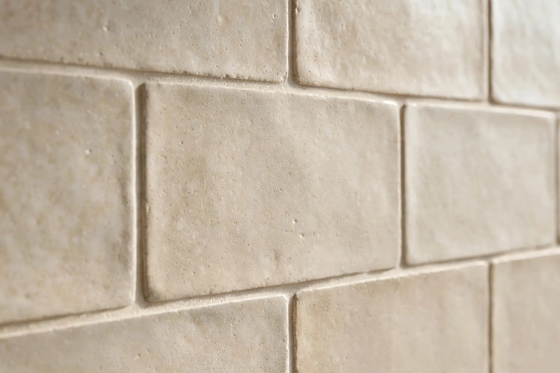
Grout is roughly a tenth of the cost and about half of the final look, and it is the thing people spend the least time on.
- Grout matched to the tile colour makes a wall read as one calm surface. This is the safest and most current choice.
- Grout one shade darker than the tile shows the pattern gently without shouting. A good middle ground.
- High contrast grout turns the pattern into the feature. It can look great in a small deliberate area and it dates fast across a whole wall.
- Thin grout lines suit machine made tile with straight edges. Handmade tile needs slightly wider lines to absorb its irregularity, and looks wrong with hairline joints.
One practical note: light grout behind a range will discolour. If you want light grout there, epoxy grout resists staining far better than standard cement grout and is worth the upgrade in that one zone.
What tends to date badly
No style is permanently safe, but some age faster than others. Worth thinking twice about:
- Busy multi-colour glass or stone mosaic sheets. They were everywhere for a decade and they instantly place a kitchen in time.
- Cool stark grey, which now makes a kitchen feel slightly cold next to the warmer woods and creams in current cabinetry.
- The narrow four inch strip. It reads as unfinished rather than minimal.
- Very trend specific shapes used across an entire wall. A strong shape works better as an accent behind the range than as the whole room.
- Tile that fights the countertop. This is timeless in the wrong way. It will bother you forever.
Budget reality
Backsplashes split into rough tiers, and knowing which tier you are in saves a lot of browsing.
The most affordable route is standard ceramic subway or square tile, laid in an interesting pattern. Vertical stack or herringbone costs nothing extra in material and changes the whole feel. This is the best value move in the entire kitchen.
The middle tier is porcelain zellige-look tile, larger format porcelain, or a good quality handmade ceramic in a small accent area.
The top tier is a full slab backsplash, authentic zellige across a large wall, or hand painted tile. Labour matters here too, since irregular and mosaic tile takes longer to set than straight edged tile, and that shows up on the quote.
One thing worth spending on regardless of tier: proper installation and the correct trim at the edges. A beautiful tile finished with a cheap plastic edge strip looks cheap. Metal trim, a bullnose edge, or a mitred return costs a little and changes everything.
Small kitchens need a slightly different approach
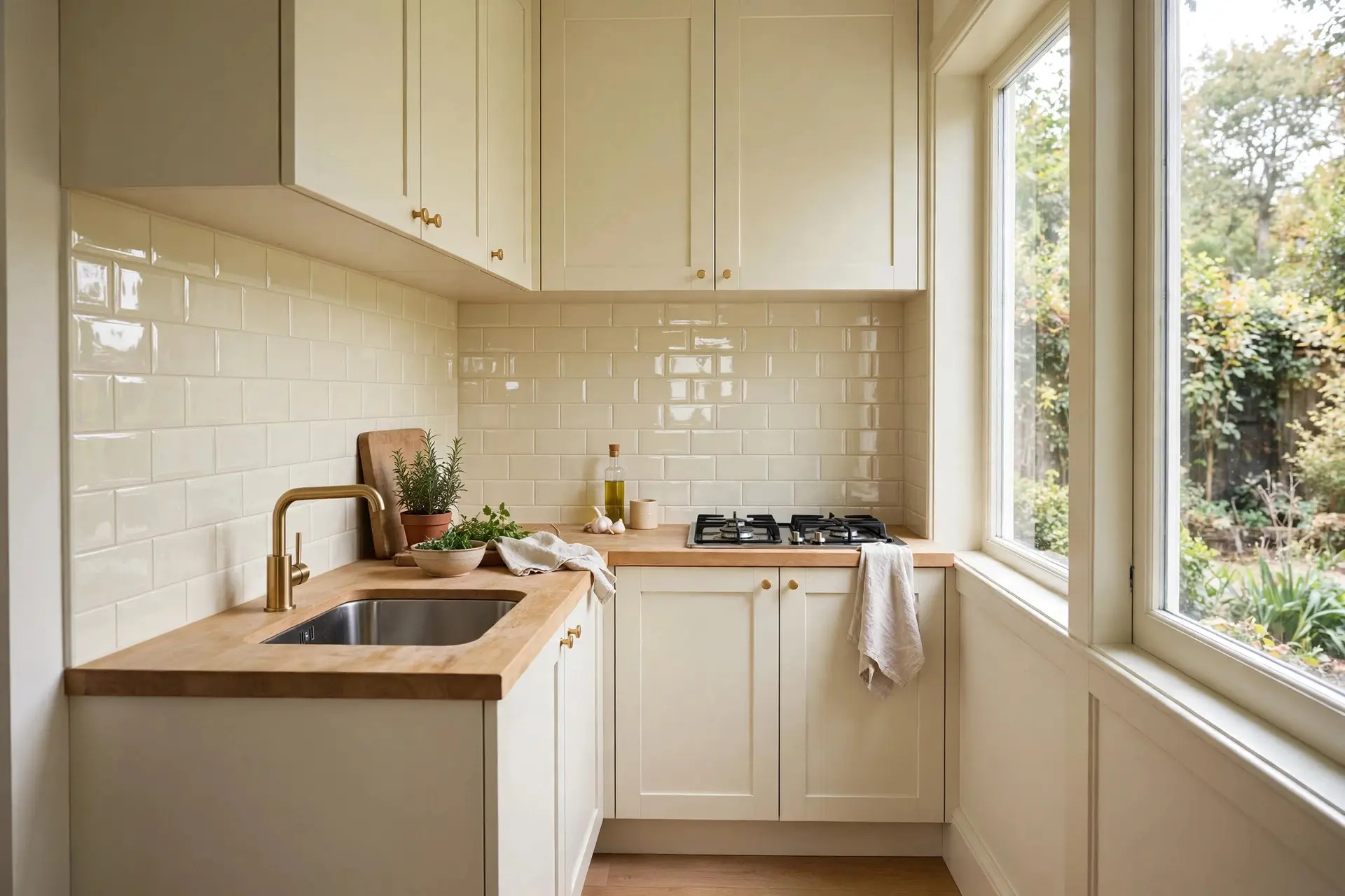
In a small kitchen the backsplash is a much larger share of what you see, so it has more power in both directions.
Go lighter and quieter than you would in a big kitchen. A continuous light surface with tonal grout makes the walls recede. Large format tile or a slab means fewer lines, and fewer lines makes a small room feel bigger.
Gloss is your friend here too. A slightly reflective glaze bounces light around a room that probably does not get much. Our small kitchen ideas guide has more on how surfaces and light work together in tight spaces.
Frequently asked questions
How high should a kitchen backsplash go?
To the underside of the upper cabinets, which is usually about 18 inches above the countertop. Where there are no upper cabinets, such as behind a range or over a sink with a window beside it, take it to the ceiling. The old four inch strip looks unfinished in a current kitchen.
Is subway tile still in style?
Yes, but the white tile with dark contrasting grout version has become dated. Use a warmer cream tile, grout matched close to the tile colour, and a vertical stacked or herringbone layout instead of the standard offset pattern.
What colour backsplash goes with everything?
A warm off white or soft cream in a simple format. It sits well against warm wood, painted cabinets, and dark cabinetry alike, and it will not fight a patterned countertop. If you want something safe but not boring, choose an interesting shape in a neutral colour rather than a neutral shape in an interesting colour.
Is a slab backsplash worth it?
If you cook a lot and hate cleaning grout, yes. It is the easiest surface to wipe down and the veining continuing from counter to wall looks genuinely luxurious. If budget is tight, use slab only behind the range and tile the rest.
Should backsplash match the countertop exactly?
It does not have to, and usually it should not, unless you are doing a deliberate full slab look. Pull a tone from the countertop rather than matching it, and let one of the two surfaces be the quiet one.
Where to start
Pick the countertop first, decide which of the two surfaces is the star, then choose a tile whose undertone agrees with your cabinets. Match the grout to the tile, run it full height, and finish the edges properly.
Do that and the tile you choose almost cannot go wrong. For more on pulling the whole room together, our guide to the modern kitchen aesthetic covers how surfaces, hardware, and lighting work as a set.